
Widgets
A widget is one live card from one integration. You place it by its key, <instance>.<widget>.
layout: - title: Watching widgets: [plex.streams, plex.recent]The key is plex.streams because this config calls its Tautulli instance plex, and Tautulli has a widget called streams. A widget you don’t place isn’t drawn and doesn’t refresh on a timer.
Overriding one
Section titled “Overriding one”A widget can be a plain key, or an entry with its own settings. Only widget is needed.
layout: - title: Lately widgets: - { widget: plex.recent, size: tall, title: New on Plex, icon: film, header: false } - { widget: dns.stats, size: small, tint: "#0a7d4f", opacity: 0.8, blur: 12 } - { widget: drives.drives, size: wide, every: 5m } - { widget: plex.top, view: coverflow }| Option | What it does |
|---|---|
size | small, wide, medium, tall or large. See sizes. |
every | How often it refreshes while someone’s looking: seconds, or 30s, 5m, 1h. |
view | How it’s drawn, whatever the data. See views. |
rows | How many rows it spans, 1 to 6, so smaller cards can stack beside it. |
title, icon | Its name and icon. On a tile, its label and icon. |
header | false drops its title bar. true keeps it in a section that drops them. |
tint, opacity, blur | Its surface: a colour, how much of it shows, and the blur behind it. |
background | An image behind it: an https:// URL, or a Valet path such as /api/icon/rack. |
A file at data/icons/rack.png is served as /api/icon/rack.
A widget’s data and the way it’s drawn are separate choices. view picks the drawing.
layout: - title: Watching widgets: - { widget: plex.top, view: coverflow } - { widget: plex.plays, view: bars }| Views | Work on |
|---|---|
Charts: line, bars, stream, race, heatmap, ranked, pie | Anything with numbers: a chart, race, heatmap or ranked card, or a stats card with a pie. |
Galleries: row, spotlight, coverflow, desk, windows, tickets, mosaic, flashback, album | Anything with pictures: a shelf, photos, ranked, race or media card. |
heatmap needs dates, because its squares are days. A view that doesn’t fit leaves the card as it was. A name that isn’t on this list is a config problem.
A view changes the card, so it doesn’t reach a small or wide tile, which shows the headline.
States
Section titled “States”A card reports what’s going on. These come from the integration, so not every card has every state.
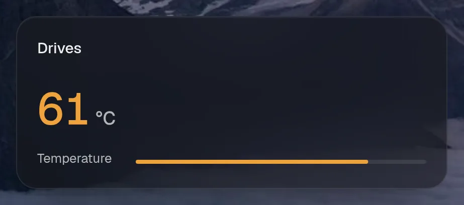
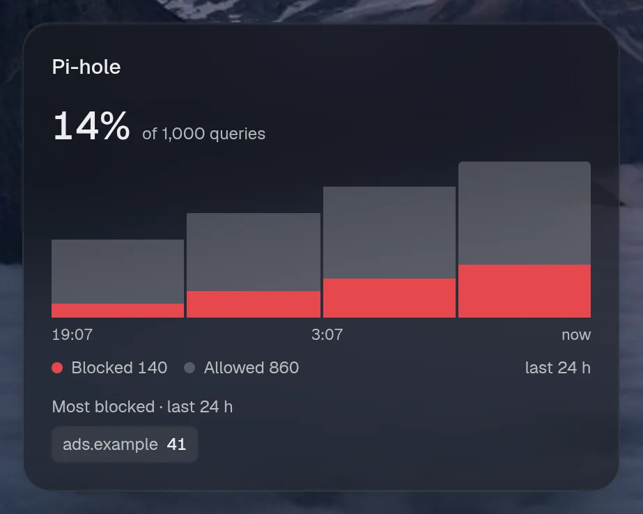
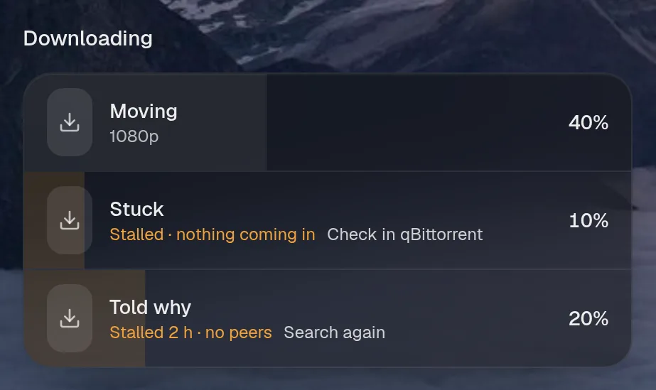
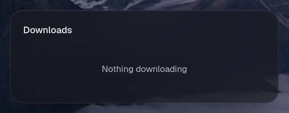
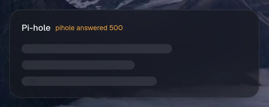
- Can’t reach it. The card names the error. If it had data before, it keeps showing that and says
stale. - Empty. Media, photo and chart cards with nothing in them give up their slot, so the page closes the gap. Other cards say so in a line.
- A banner is a state you chose and shouldn’t forget, such as paused blocking. It sits at the top of the card with the way out beside it.
Opening the page
Section titled “Opening the page”The page holds itself hidden for a moment, until most of its cards have their first data or 0.9 seconds have passed. Then it appears whole, so cards don’t pop in and push each other around.
Live things
Section titled “Live things”A card can announce something happening right now: a stream, a download, a robot cleaning. List those widgets in live.activities and the live ones show as rings in the top bar, most important first.
Valet’s own widget
Section titled “Valet’s own widget”valet.activity is built in and needs no integration. It’s the log of what the assistant and the page did.