
Cards
A card is a plain object in one of a fixed set of shapes. The catalog is in src/shared/cards.ts. Integrations return data in these shapes and the web app draws them. They never ship HTML, CSS or components.
{ type: 'stats', title: 'Pi-hole', items: [{ label: 'Blocked', value: '14%', tone: 'good' }], summary: { label: 'Pi-hole', value: '14%', sub: 'Blocked', tone: 'good' },}This has three results:
- A community integration looks the same as a built-in, and can’t inject anything into the page.
- The assistant can compose cards from different services side by side.
- A new kind of display is one new card type, and then everything can use it.
The same card everywhere
Section titled “The same card everywhere”The widget on the page and the assistant’s answer are the same object, drawn by the same code. In chat it comes out denser.
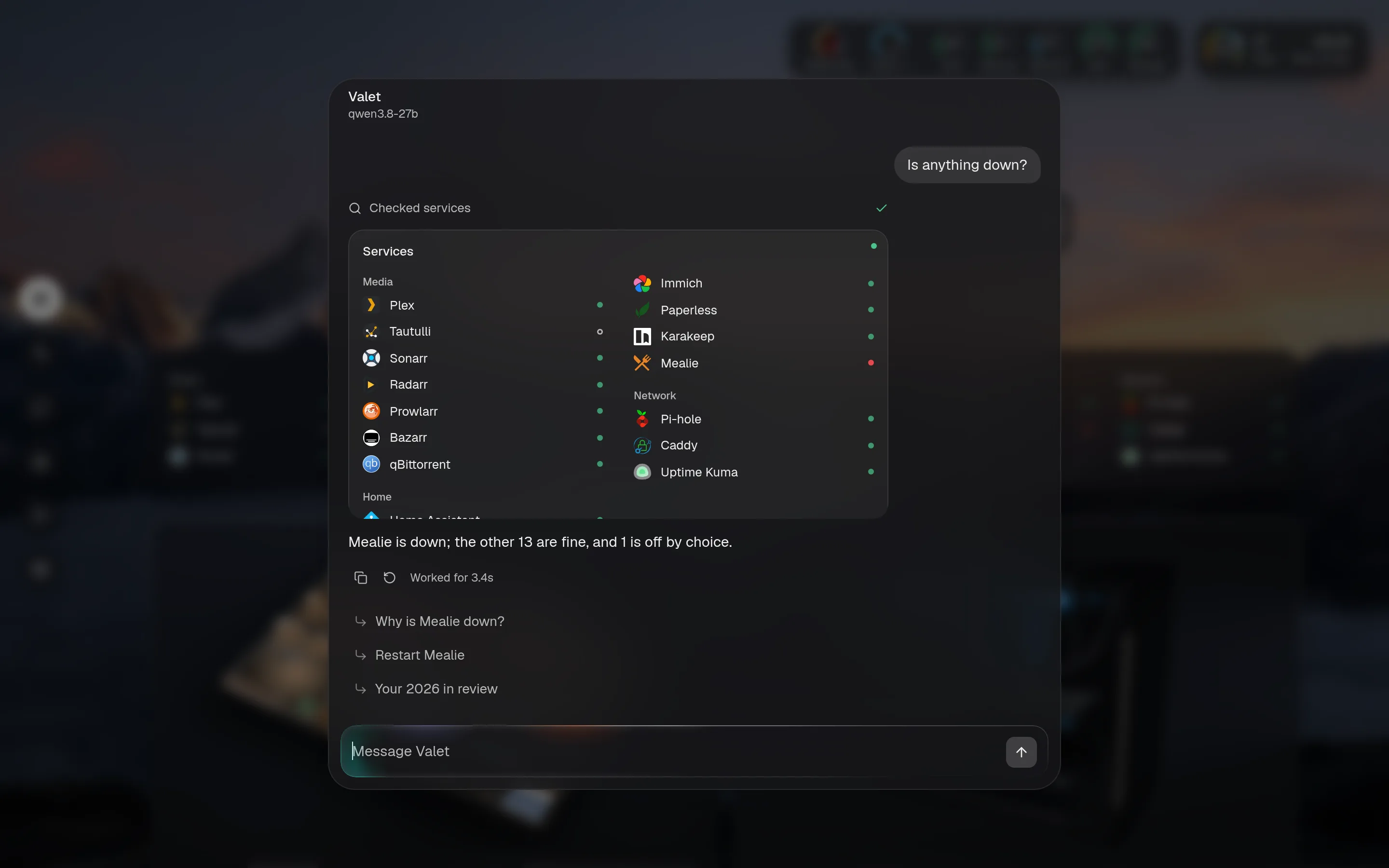
The parts every card can have
Section titled “The parts every card can have”| Part | What it does |
|---|---|
summary | A headline: what the small and wide sizes show, and what tiles, rings and the menubar use. |
summaries | Several headlines from one card, such as CPU, memory and each disk. |
activity | Something live, for the rings in the top bar. Set only while it’s happening. |
banner | A state you chose and shouldn’t forget, at the top of the card. |
buttons | Quick actions along the bottom. |
source | Where it comes from, shown beside the title. |
The card gallery shows every type, with its fields.
A value can carry a tone: good, warn, bad, accent or neutral. Green, orange and red appear only for status.
Rich visuals
Section titled “Rich visuals”The 3D house and PC are showcase cards. Their visual loads only when a page uses one, so pages without them never download it.
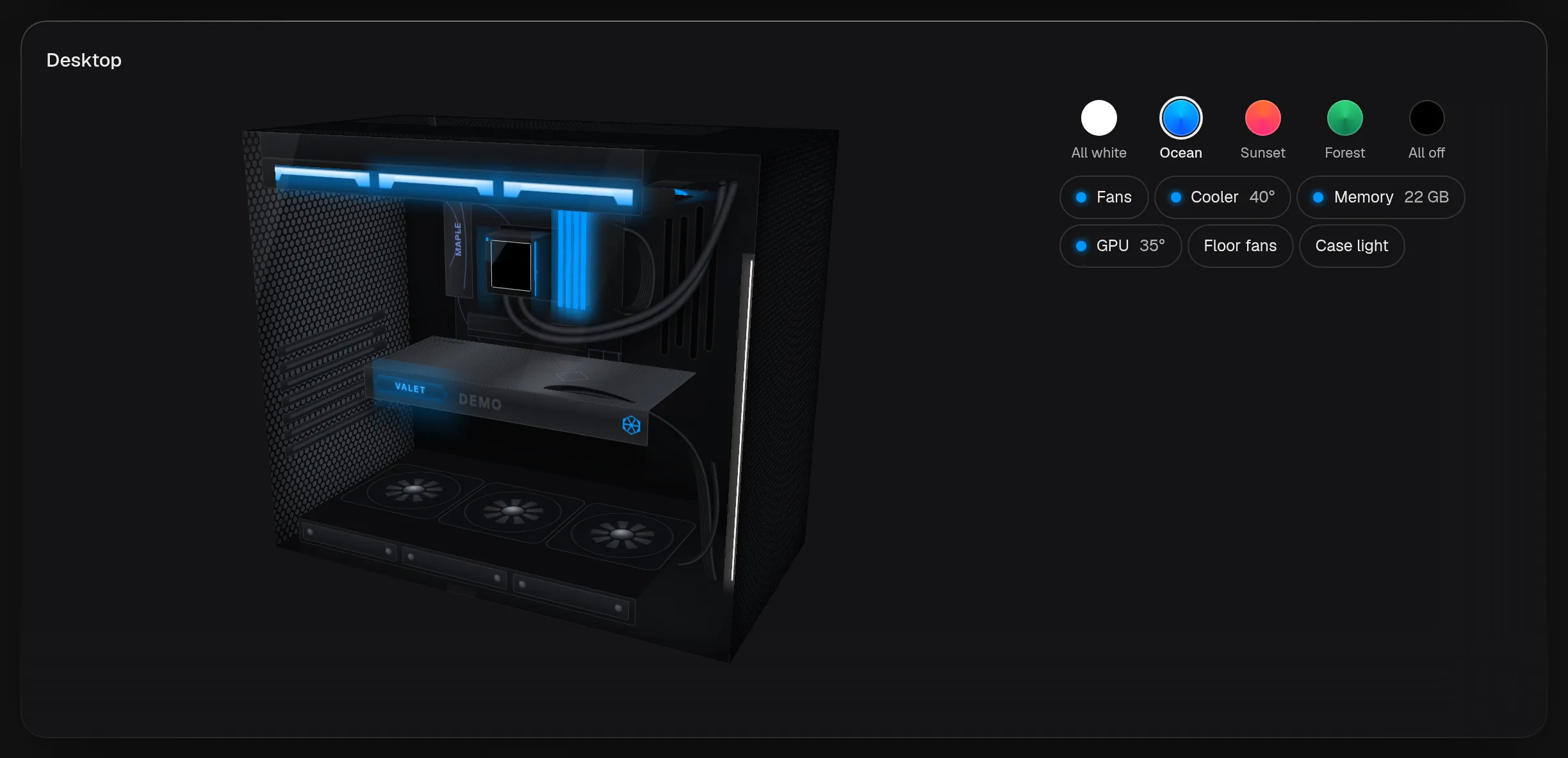
A plugin can bring its own visual as a browser module. See the plugin toolkit.