
Tabs
A section with a title or a tab gets a button in the rail. The overview shows every section that doesn’t opt out, and each tab shows its own. Changing tab is a quick fade, unless appearance.motion or your system says not to.
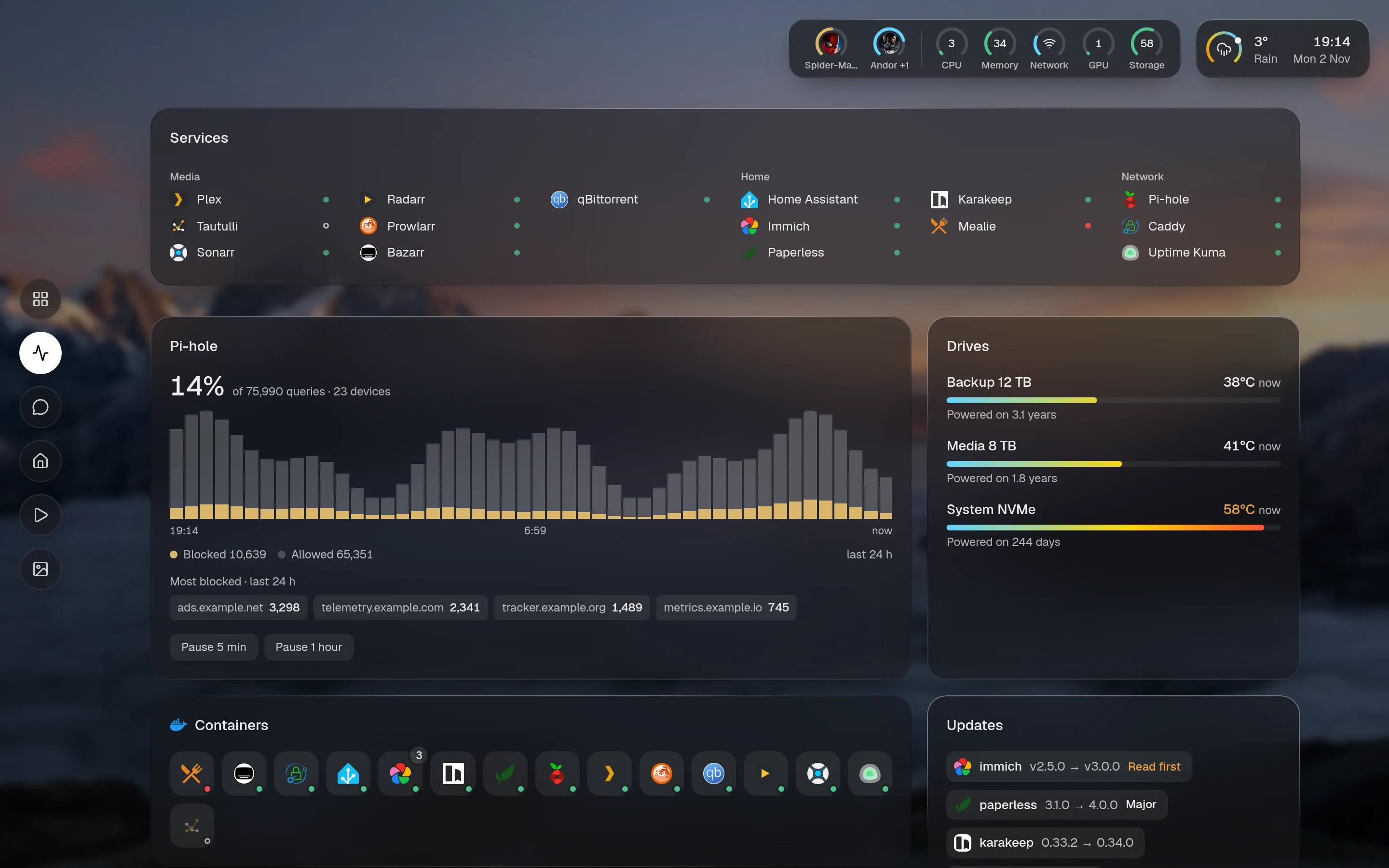
Overview or tab
Section titled “Overview or tab”layout: - title: Now widgets: [plex.streams] # on the overview, and on its own tab - title: Library overview: false # only on its own tab widgets: [docs.recent]A section with neither title nor tab sits on the overview and gets no button.
Several sections on one tab
Section titled “Several sections on one tab”tab names the tab a section belongs to. It defaults to the title.
layout: - title: Home overview: false widgets: [cams.cameras] - tab: Home overview: false heading: false columns: 1 widgets: [house.plan]Hiding the extra heading with heading: false is common here.
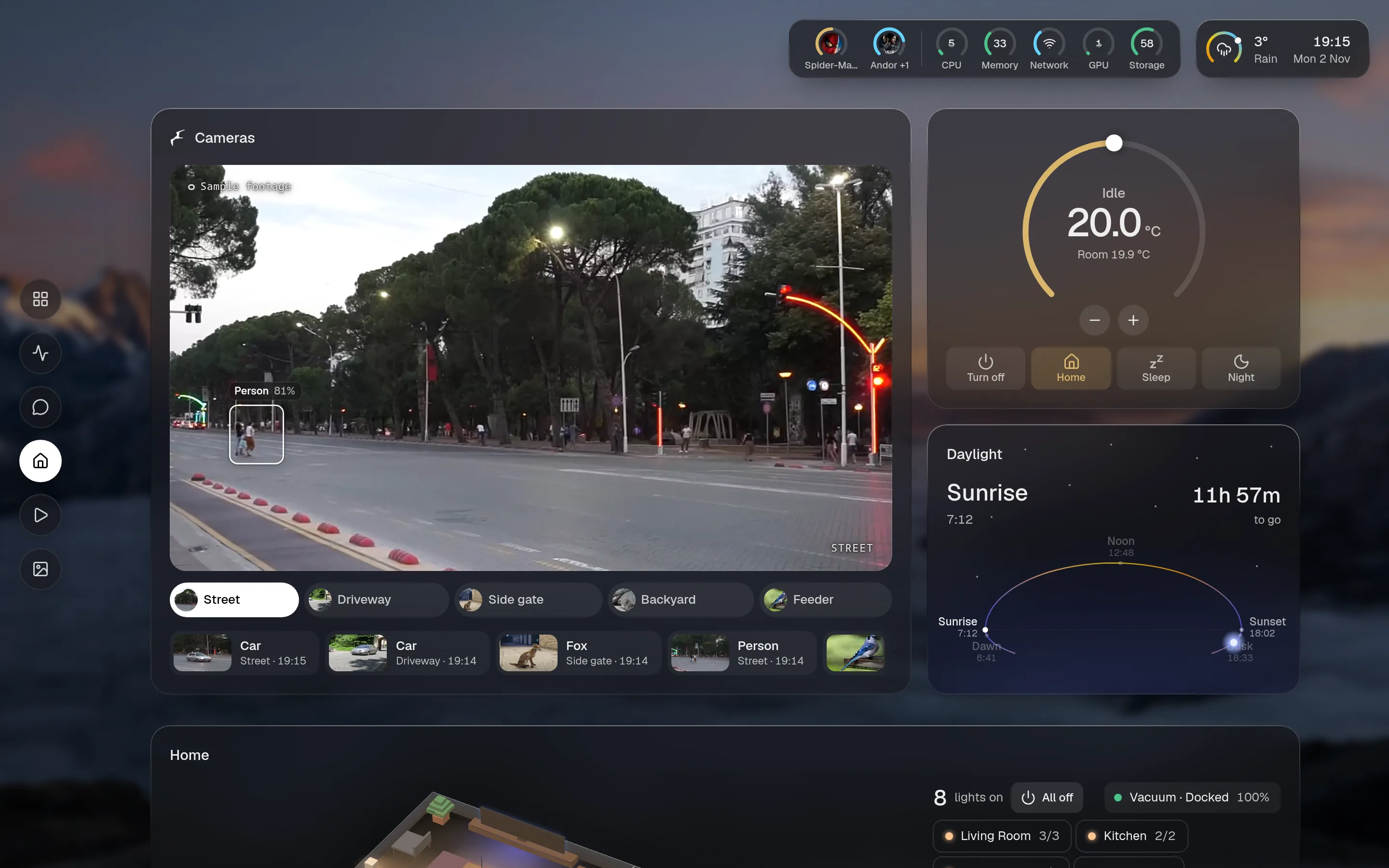
Order and icons
Section titled “Order and icons”Tabs follow the layout. nav.order overrides that, by name, and the rest follow in layout order. A tab’s icon is its first card’s, unless the section sets icon.
nav: order: [Services, Home, Media] hide: [Reading] # also Overview, or the assistant's name to hide its button side: left # left, right, top or bottom style: icons # icons, labels or bothside and style apply on wide screens. Phones always have icons along the bottom.
The assistant’s tab
Section titled “The assistant’s tab”chat: true on a section puts the assistant on that tab, full page, next to the section’s widgets.
- title: AI display: tiles overview: false chat: true widgets: [gpu.usage]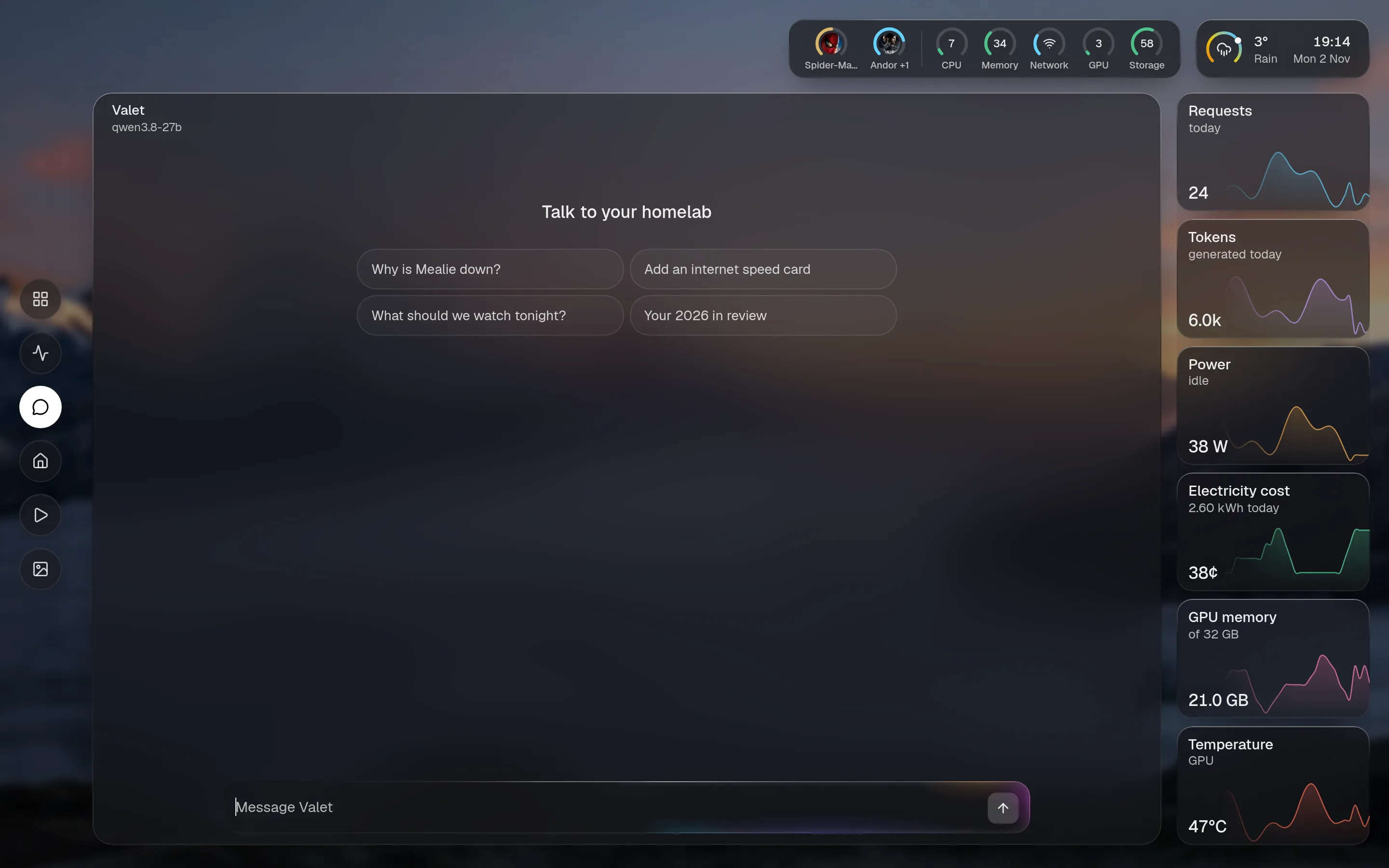
A wallpaper per tab
Section titled “A wallpaper per tab”appearance: wallpaper: /app/data/wall.jpg wallpapers: { Media: /app/data/film.jpg, Home: "#102030" }The name must match a tab. config check lists them if it doesn’t.
Links to a tab
Section titled “Links to a tab”Each tab has an address: # and its name in lower case, with anything else as -. Now playing is #now-playing. That makes a tab easy to bookmark.